Color Usage - Web Accessibility for Developers
Published: 2023/5/30

This is a continuation of a series on ADA and WCAG 2.1 compliance. If you don't know much about the ADA or Web Content Accessibility Guidelines 2.1, I recommend reading my introductory article to get a better understanding before reading on.
Color is an important part of web design. It helps an organization's website match their branding, and can psychologically influence visitors such as affecting their mood, buying choices, and other perceptions.
If not used carefully however, color usage can raise accessibility issues. The first two common problem areas the ADA website mentions are poor color contrast and use of color alone to give information, so that's what this article will cover. I'll also include color blindness considerations since that could have an impact on color choice.
Poor Color Contrast
WCAG2.1 states that at a minimum, a color contrast ratio of 4.5:1 (which is AA compliant) should be observed with text on a website. The contrast ratio is between the text and the background color, and inverting these colors will still result in the same contrast ratio. There are exceptions to this 4.5:1 minimum ratio however, such as large text only requiring a 3:1 ratio. Note that with CSS, large text is considered to be 24px or about 18px with bold font weights. Then there's the following, which have no color contrast requirements at all:
- Text or images of text that are part of an inactive user interface component, such as a disabled submit button on a form.
- Text or images which are purely for decorative purposes.
- Invisible text or images of text.
- Text that is not important when compared to the image itself. For example, an article highlighting shopping trends might include an image of a mall where many store names are visible. The names of the stores are not necessarily important, so they have no contrast requirement.
- Logotypes, or text that is part of a logo/brand name.
With these exceptions, one just needs to consider whether the text or image of text has any significant meaning to your page content. If it does, it should follow color contrast rules.
There is also the more stringent WCAG2.1 AAA compliance, which requires a color contrast ratio of 7:1. I consider this to be the ideal, but it is very limiting on color pallet combinations, and may not be possible with your website's branding and color scheme. If you can hit this ratio then great, but 4.5:1 should be your minimum.
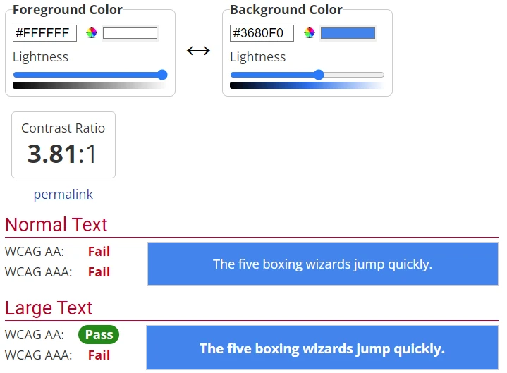
Let's take a look at an example of some text which does not meet 4.5:1 color contrast requirements.

While this is readable to many of us, it doesn't quite hit the mark. Using Axe Dev Tools on the site I lifted this banner off of, it calls out: Element has insufficient color contrast of 3.81 (foreground color: #ffffff, background color: #3680f0, font size: 12.0pt (16px), font weight: normal). Expected contrast ratio of 4.5:1. You could also do this check manually by finding color hex values through inspecting the CSS of the elements you're checking, or using an eye dropper browser extension that shows hex values. Then, using the WebAIM Contrast Checker you can calculate the contrast ratio using the values you collected.

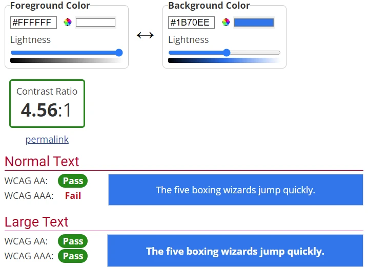
WebAIM confirms what Axe Dev Tools initially told us, and even gives us handy sliders we can use to adjust the colors to get to a compliant ratio. If we adjust the slider on the background color to make it darker, we can get a similar look that is compliant:

Poor Contrast on Gradients and Images
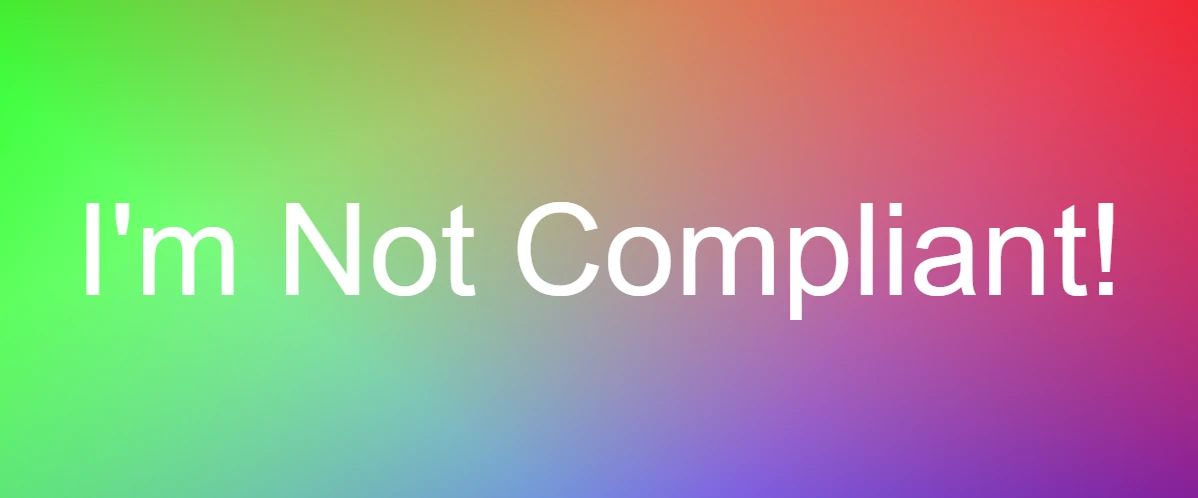
Text on solid backgrounds is easy to analyze for static tools like Axe Dev Tools, WAVE, or Google Lighthouse, but they don't know how to handle text which lies on top of an image or color gradient. This is where that combination of an eye dropper extension and WebAIM can help. WCAG 2.1 doesn't actually mention how to measure contrast in these situations, but WebAIM's article on contrast recommends testing the area which has the lowest contrast to ensure compliance. Take this CSS gradient with text for example:

Running Axe Dev Tools on the page with this content claims there are no issues detected. Using an eye dropper tool however, the purple and pink areas on the right are compliant with ratios of 5.06:1 and 4.52:1 respectively. But, the farther left you go the worse the color contrast gets, bottoming out at 1.31:1 for the green areas on the left. This gradient and text combination would not be compliant as a result. This also is a good example of not relying heavily on one tool when doing compliance checks. This methodology can also be used to check the color of text overlaid on a CSS background image, or HTML image tags that have text absolutely positioned on top of them.
Using Color Alone to Convey Information
If you've ever used Bootstrap before, you'll be familiar with the utility classes for button varients, ie: btn-primary, btn-success, btn-danger etc. Each of these utility classes adds color to elements, which is helpful to give the user hints about the content they're interacting with. Green colors are often associated with success or validity, while red colors are associated with errors or immediately important information. There's nothing wrong with using these colors in conjunction with text to inform the user, but using them alone is not ADA compliant. Take this form input for example:

Say you're implementing form validation for this email input. Your validation runs on blur, and the user gives an improperly formatted email address. Your validation technique would not be ADA compliant if all it did was update the border to be red to convey that there's an issue. You must also include error text along side it like so:

As a bonus, adding this error text helps your form be ADA compliant as well, but we'll cover form validation in greater detail in another article.
Color Blindness
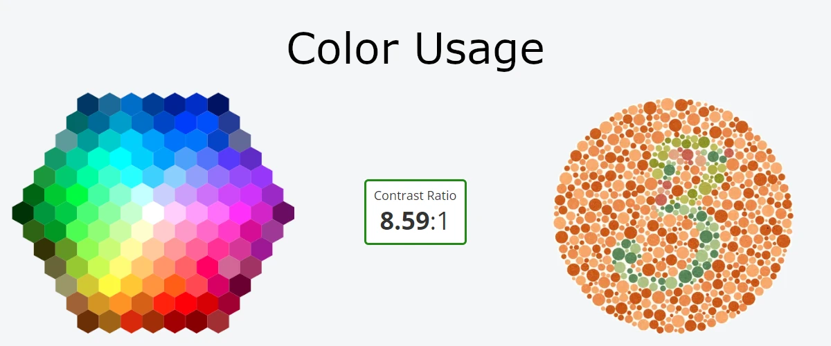
The use of color alone to convey information also leads to issues involving those who are color blind. There are many types of color blindness, with the big three (in order of how common they are) being:
- Red-green: Where reds can look like green, green can look like red, or neither are distinguishable at all.
- Blue-yellow: Where blue and green look very similar, as do yellow and red. There's also a type where yellow and pink, blue and green, and purple and red are hard to distinguish.
- Monochromacy: One does not see color at all.
Accommodating color blind individuals in all aspects of a website can be tricky depending on your branding. What you should focus on is the content they will be interacting with. Avoid text and background color combinations that any of the red-green or blue-yellow color blind individual could have trouble reading. Also, maintain the 4.5:1 contrast ratio so that users with monochromacy can enjoy your content too, and especially don't rely on color alone to convey information for these individuals.
Closing Remarks
The usage of color is important to help your website stand out, but which color combinations you use need to be made with ADA compliance in mind. I hope this article has helped you grasp the topic better, and given you some techniques you can use to audit your sites.
Thank you for reading, and look out for my next article on accessibility!